I’m a font snob. I’ll own it. But I don’t really think that’s a bad thing. One of the problems is that I notice fonts ALL THE TIME. I can’t help myself. I notice darn font “Papyrus” all the time. Of course many people notice the font Comic Sans and how it should never be used for anything other than third grader’s first writing assignment (if that…)
Anyway, as I was flipping through the channels on my Xfinity TV guide yesterday I noticed an advertisement on the bottom of the screen. It was an advertisement for a new album by the band The Band Perry called “Pioneer.” The strange thing is that I noticed that the word “Pioneer” looked awfully familiar.
A few classmates from my high school started a band called News From Verona a few years back and they later changed their name to Pioneer. Look how similar the font for the band Pioneer is to the font used by The Band Perry’s album Pioneer.
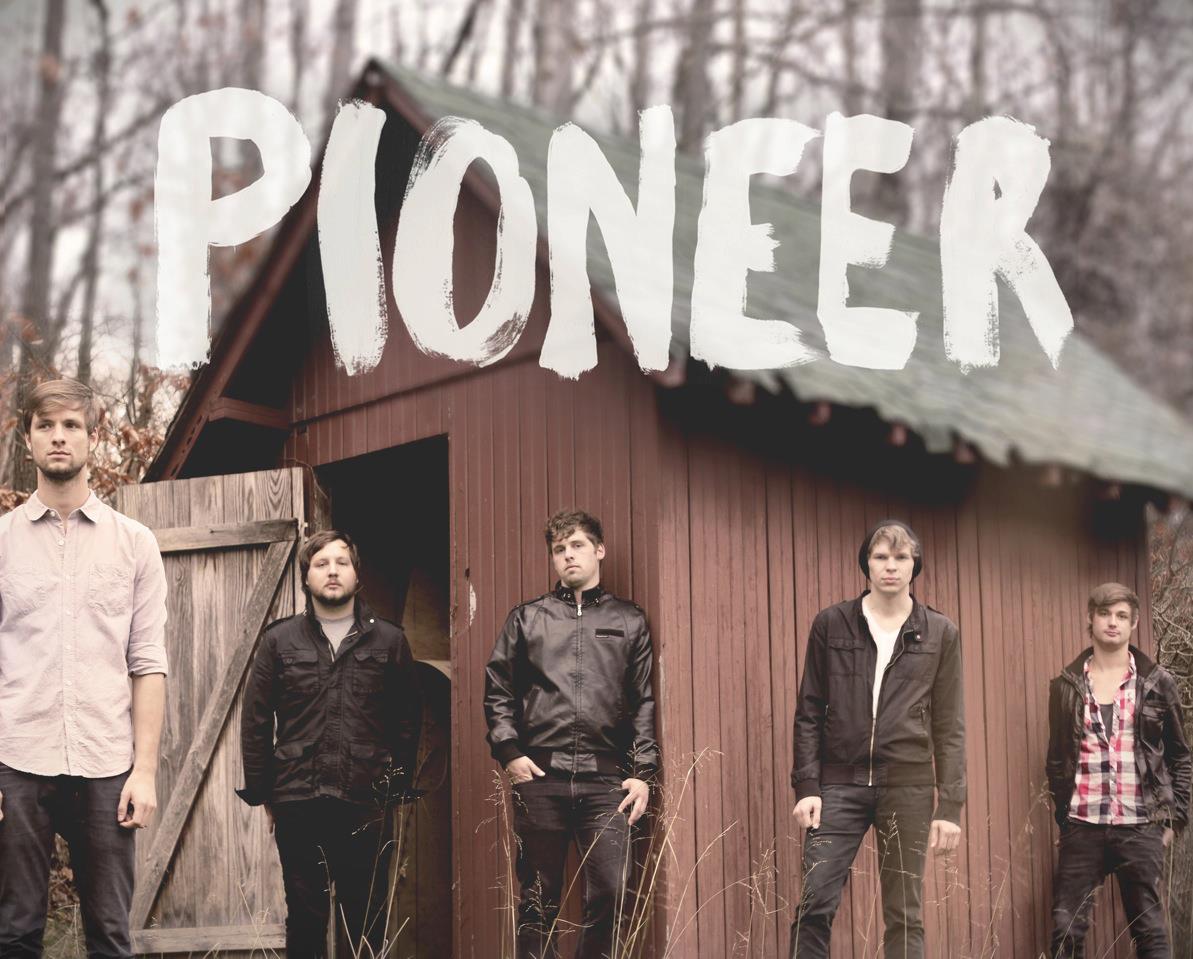
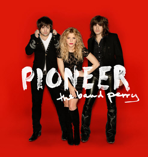
Very similar. A little TOO similar if you ask me. Pioneer — the band — was out first, by the way. I guess the word Pioneer makes you want to write it in a font that looks like it was painted?

Hi there! I’m actually looking for a font that is very similar to this – do you know of any? Thank you!